If your sewing room is anything like mine, July is the month where the heat outside drives you firmly, joyfully, and with zero regret straight back inside ~ and straight into the stash.

And just sew you know, this is exactly where I want you. Because this summer, the quilting trend worth obsessing over is the stained glass quilt, and it is the best color theory lesson you will ever get for free.
(Penny has been staring at my design wall for two weeks now. She has Opinions. We're taking notes.)
Why Stained Glass Quilting Is Your Color Theory Classroom
The stained glass quilt technique works exactly like it sounds: black fabric plays the "lead" (those thick dark outlines you see in cathedral windows) and your print fabrics become the jewel-toned glass. It teaches the single most important rule of mixing quilting prints:
Contrast is everything.
Not just different colors. Different values. Light against dark against medium, stacked with intention. Traditional color theory, the kind designed for painters, doesn't quite translate to fabric. A palette that makes perfect sense on a color wheel can go completely muddy on a design wall, because print scale, texture, and value all get a vote.
The stained glass technique fixes this in one step. The black sashing does the heavy lifting ~ your fabrics just have to be rich, saturated, and willing to glow.
Here's what a few quilty friends in our cozy circle had to say after finishing their first stained glass projects:
> "I've been quilting for fourteen years and my palettes always went muddy. One stained glass quilt and I finally understand value. I want to go back and fix everything I've ever made." ~ Deborah R., guild president and very recent convert 💜
> "Started with a stack of scraps, a yard of black, and absolutely no plan. My husband thought I hired someone. The sashing does all the hard work and you just get to have fun." ~ Marcy K., who now has a second one pinned on the design wall (naturally)

The Summer Palette Prescription
Summer quilting palettes are not spring palettes. Spring is soft ~ watercolors, whispers, the kind of color that sighs gently. Summer is loud and a little bit on fire, and stained glass work was practically invented for it.
Here are three summer palettes worth pulling this season:
- The Cathedral Window palette: deep cobalt blue, amber gold, and a true red. Saturated, unapologetic, and absolutely alive against black sashing. (Also ~ hello, Bastille Day is tomorrow. A very chic occasion to go full blue, white, and red if you're feeling inspired.)
- The Garden After Rain palette: emerald green, hot coral, and sunny yellow. Rich, warm, and one of those combinations that sounds chaotic on paper and looks genuinely gorgeous on the quilt. Trust the chaos.
- The Night Sky palette: midnight navy, silver white, and the occasional punch of violet. For quilters who like their drama at 11 p.m., when they absolutely should be sleeping but cannot leave the design wall.
Pick one and commit. A stained glass quilt that tries to do all three palettes at once usually ends up being none of them. (This is a lesson I learned personally. My "everything" quilt lives in a bin, where it absolutely belongs.)
How to Mix Prints Without Losing Your Mind
Print mixing is an art form. It's also, let's be honest, a little bit of a dare.
The safest combination for stained glass work is this: one busy print, one quieter print in the same color family, and your black sashing. Three components. One clear focal, one supporting player, one strong outline. You don't need more than that to make something genuinely beautiful.
When you're shopping your stash (or hunting for new yardage), ask three questions before anything goes in the pile:
1. Does this read as the right VALUE? Light, medium, or dark ~ where does it actually sit? The squint test works here. Squint at your fabrics. If everything blurs into the same medium-value muddle, you need more range.


2. Does the print SCALE play nicely with the others? A large print next to a medium print next to a small print is almost always safer than three large prints arguing over the lead role.
3. Is there one color threading through all of them? A shared color running across your entire pull creates visual harmony without making everything look like a matching set.
Three yes answers ~ you have your palette. Go make the quilt. (Penny will supervise. She always does.)
The Legacy in Your Hands
Here's something that hits differently when you're stitching stained glass work: quilting has always been visual storytelling. The color choices earlier generations of quilters made were never random. They were resourceful, deliberate, and beautiful under real material constraints.
We have more than they had ~ every color, every print, every value range imaginable. What we also have is the chance to use all of it with intention.
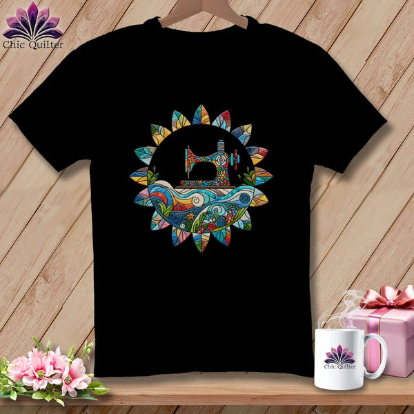
And while your stained glass quilt is baking on the design wall, a quilty graphic tee is your daily uniform. Because you're not just a quilter with an impressive stash. You're part of a long lineage of makers who understood that fabric is how you tell the truth about your life. Come browse the tees at chicquilter.com, pick the one that feels like it was made for exactly you, and wear the legacy while you build it.
If you're planning a red, white, and blue stained glass quilt this season (highly recommend: high contrast, strong values, zero ambiguity about who's in charge of the palette), pull your boldest true red and your deepest cobalt and let the black sashing referee. July is a very good month to be loud and quilty simultaneously.
Start With What's Already Waiting for You
Here's the most overlooked truth about summer color theory for quilters: your perfect palette is probably already in the stash. Hiding. Waiting patiently.

Before you go shopping for new yardage, try this first. Pull everything in ONE color family ~ every fabric in your entire stash that has blue in it, for example. Lay it all out. Sort by value, lightest to darkest. You will almost certainly find your anchor fabric, your supporting cast, and your low-volume counterpart already present and accounted for.
Then pull your black sashing fabric. Or deep navy, if you want a softer lead.
And start playing.
That pile you're looking at? That's your stained glass quilt. It was always in there.
For the days when the design wall is clearly winning and you need someone in your corner ~ we're here. Same as always. Warm light, purple heart, and a very opinionated cat deciding which fabric goes in the center. 💜
Warm stitches & color theory rabbit holes,
Jenny, Jacqueline & Judy
(Penny has nominated herself Chief Value Consultant. She is very serious about the cobalt.) 💜
P.S. The stained glass technique is already making the rounds at guilds everywhere ~ your first one deserves the right fabrics. And the right tee to wear while you make it.