You know that moment ~ three fabrics pulled, arranged on the cutting table, and you're squinting at them like the answer is buried in the print somewhere. Are they perfect together? Are you a genius? Or have you officially lost your mind?

(You're fine. Probably. Let's talk about it.)
Summer has a particular way of making quilters bold. The light shifts, the energy picks up, and somehow the season gives full permission to reach for fabrics that would've stayed on the shelf in February. Saturated corals. Zesty lime greens. That batik you've been nervously circling for two years. Summer says: now. (And we are, as always, sew here for it.)
Mixing prints confidently ~ without ending up with something that reads as "accidentally modern art" ~ takes a few reliable tricks. Here are the ones that actually work.
Temperature Beats Matching
The first thing most quilters get wrong is trying to match colors when they should be matching temperature.
Warm fabrics ~ peaches, corals, golds, rusts, certain orangey purples ~ play naturally together even when the prints are wildly different in scale and style. Cool fabrics ~ teals, blues, soft greens, silvery lavenders ~ do the same. The secret is committing to one side of the temperature scale as your base, then letting the prints do whatever they want within it.
A summer pull grounded in warm tones will feel cohesive even if you've got a ditsy floral sitting next to a bold geometric and a painterly abstract. Keep them warm, and the eye finds harmony before it finds chaos.
(This sounds obvious until you test it and realize you've been accidentally fighting your own fabrics for years. Not naming names. Just saying.)
Scale Is the Real Secret

Print scale is where experienced quilters quietly win. When every fabric in a pull is the same visual size ~ all small, or all large ~ the quilt reads flat. The mixing starts to look accidental rather than intentional.
Try this instead: one large statement print, one medium texture or geometric, and one near-solid or tone-on-tone. Three scales, same temperature family, and suddenly you've got something that looks like it was planned from the beginning.
Summer palettes are especially forgiving here because the season already has personality. A large tropical leaf, a medium stripe, and a tiny coral dot? That's a quilt with a genuine point of view ~ and a really good reason to go back to the fabric shop.
The Ugly Combo Test
Here's the trick that trips people up most: the fabrics that look worst together on the bolt often make the best quilts.
When two prints create a little visual tension ~ a warm orangey-red next to deep forest green, a bold floral next to a structured stripe ~ the eye has to do a tiny bit of work to reconcile them. That work is what creates interest. A pull that matches too perfectly can feel quiet. A pull with intentional friction has something to say.
This summer, reach for the fabric that makes you a little nervous. Test it on the design wall. You might be completely wrong... or you might be onto something genuinely interesting. (Penny has strong opinions about this. They are mostly correct.)
Retro Palettes Never Really Left
If you've been noticing a lot of warm, vintage-inspired color stories lately ~ in new fabric collections, in the quilts showing up all over your feed ~ you're not imagining it. The retro aesthetic is fully back, and it is absolutely influencing the quilting world right now.


Think harvest golds and avocado greens meeting cheerful mid-century prints. Think bold, graphic florals in that hazy, slightly softened palette that somehow looks better than anything too-bright. Think warm cream backgrounds with unexpected pops of rust or burnt sienna.
These palettes work because they're confident without being loud. They have that lived-in, beloved quality ~ the feeling of a quilt that has been somewhere, carried by someone. If you've been wanting to try a bold summer color pull and you're not sure where to start, a warm retro palette is a genuinely strong answer right now. It's approachable, it's everywhere, and it photographs beautifully on a clothesline.
Your Studio Wardrobe Wants a Say
Speaking of bold and color-maxed ~ the shop has a few things calling your name right about now.
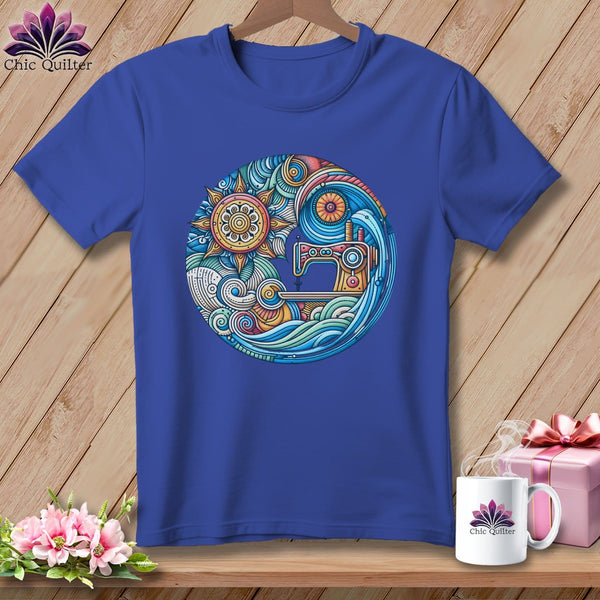
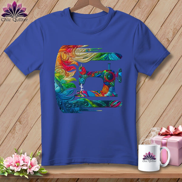
The Tidal Threads Relaxed Fit Tee is basically a summer color theory lesson in wearable form ~ swirling waves, saturated palette, the kind of color story that would look completely at home hanging on your design wall next to the current project. It is summer, in shirt form. (Penny approved the colors. Eventually.)
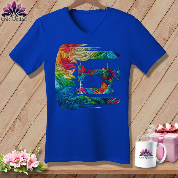
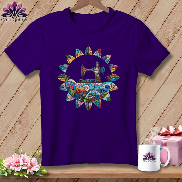
If you've officially earned the title of print master after reading this ~ and you have ~ the Fabric Wizard Relaxed Fit Tee already knows it. Because there's a real difference between pulling fabrics and crafting a palette, and now you know exactly which one you're doing.
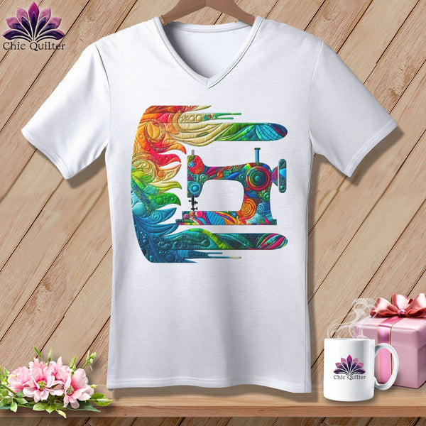
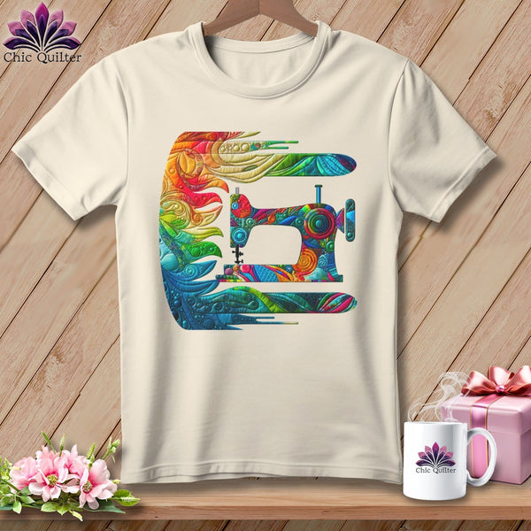
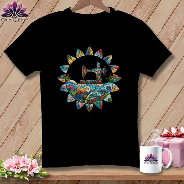
And for the quilter leaning fully into warm, peachy, unapologetically summer energy, the Peaches Plume Relaxed Fit Tee is exactly what it sounds like: quilty, warm, a little chaotic, and completely at peace with all of it. 💜
The Actual Biggest Mistake
Everyone expects the answer here to be "too many prints." It isn't.

The real culprit is this: pulling fabrics one at a time, by individual favorites, rather than pulling as a group. We fall in love with prints one bolt at a time ~ drawn to the charm of one, the color of another. But a quilt is a conversation, and the fabrics have to talk to each other, not just to you.
The fix is simple: before you commit, lay everything out and step back. Not a glance ~ an actual step back, maybe to the other side of the room. Look at the group as a whole. Does something scream? Does something disappear? Is there a rogue cool-toned fabric sneaking into your warm summer pull?
This is also where a design wall earns its keep. Even a flannel sheet pinned to a door is enough to see what a pull is really doing before a single piece is cut. If you don't have one, this summer is an excellent reason to finally make the thing happen.
Sew, Here's the Thing
Color theory can sound like a lot for a practice that's supposed to bring pure joy. And it is a lot, if you try to force it into a checklist.
But the ideas above aren't rigid rules ~ they're patterns that experienced quilters noticed because they kept working. Use them as a starting point, not a rubric. Because the quilt that broke every rule and still came together beautifully? That happens too. All the time.
Pull the fabric that makes your heart do something. Test it. See what it says. The worst outcome is a recut, and the best is a quilt nobody else would have made.
That's the quilty magic of it. 💜